Branding & Visual Identity
Learning Lab
Learning Lab is on a mission to build a world where people with exceptionalities thrive. From advocacy and motivation, to systems and structures, Learning Lab has a holistic approach to achieving equity and inclusion.
The team approached me to craft a visual identity that reflects their innovative approach and builds trust with their audience — from students to educators and advocacy professionals.
My goal was to design a clean, modern, and flexible brand system that empowers the Learning Lab team to communicate clearly across digital and physical platforms.

Discovery and Research
The project began with a collaborative discovery session where I sat down with the Learning Lab team to deeply understand their mission, audience, and long-term vision. We explored what sets them apart, the emotions they wanted the brand to evoke, and the practical challenges they faced in communicating their message visually.
Based on this conversation, I put together a comprehensive creative brief that outlined the brand’s core values — commitment, accountability and proactivity — and set the foundation for the visual direction. This document became the reference point throughout the project, ensuring every design decision aligned with Learning Lab’s goals.
Alongside the brief, I researched visual trends in the education and creative industries, competitor branding, and other success stories. This helped define the tone — modern, playful, yet credible — and inspired a design system that feels fresh, flexible, and future-proof.
Concept Development
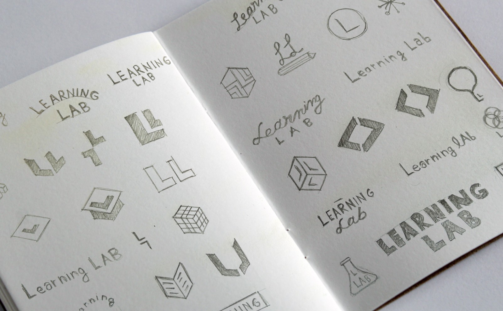
Early sketches and explorations focused on combining education symbols with abstract forms that suggest inclusivity and connection. Through iterations, we refined the concept into a simple yet memorable logo that balances structure and playfulness — perfectly aligned with Learning Lab’s values.
Final Logo Design
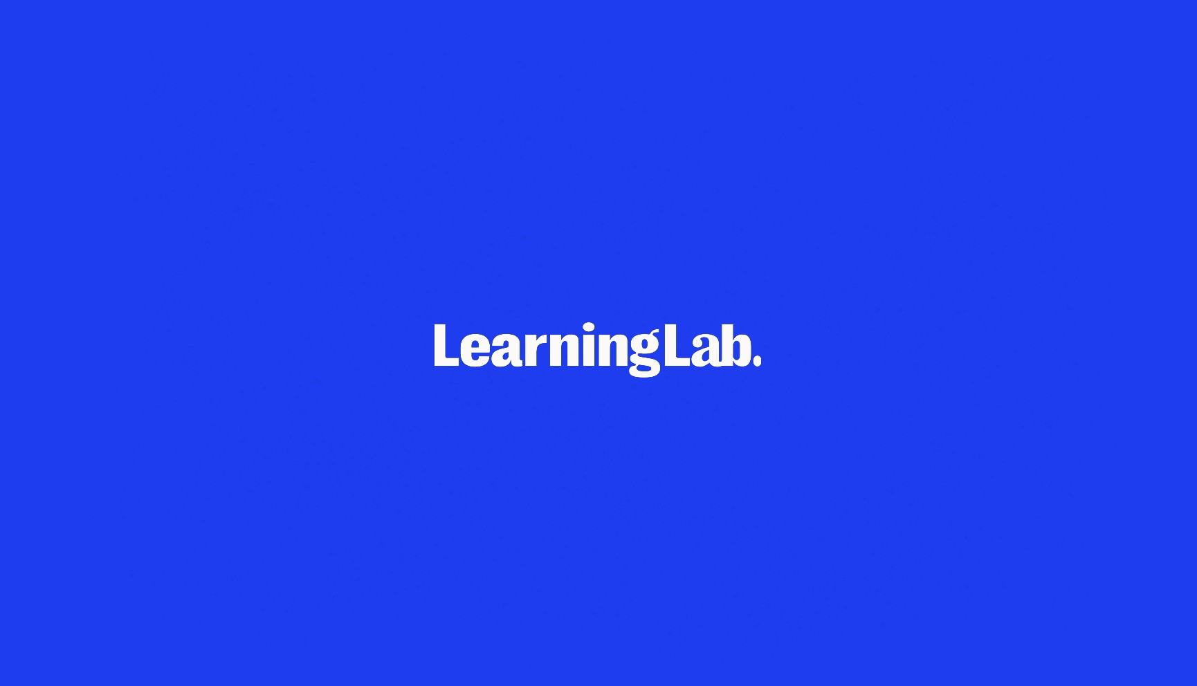
The final logo is built on a clean and balanced font that represent Learning Lab’s commitment to inclusivity and accountability. It’s simple, modern, and highly adaptable — designed to work seamlessly across digital and print applications.
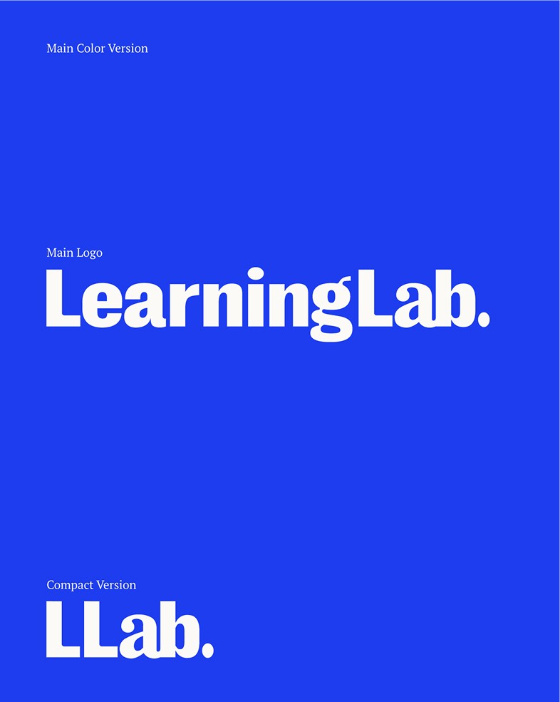
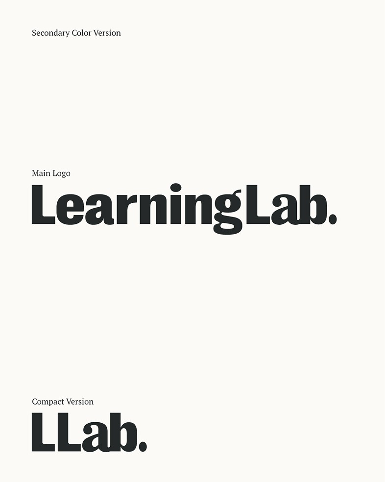
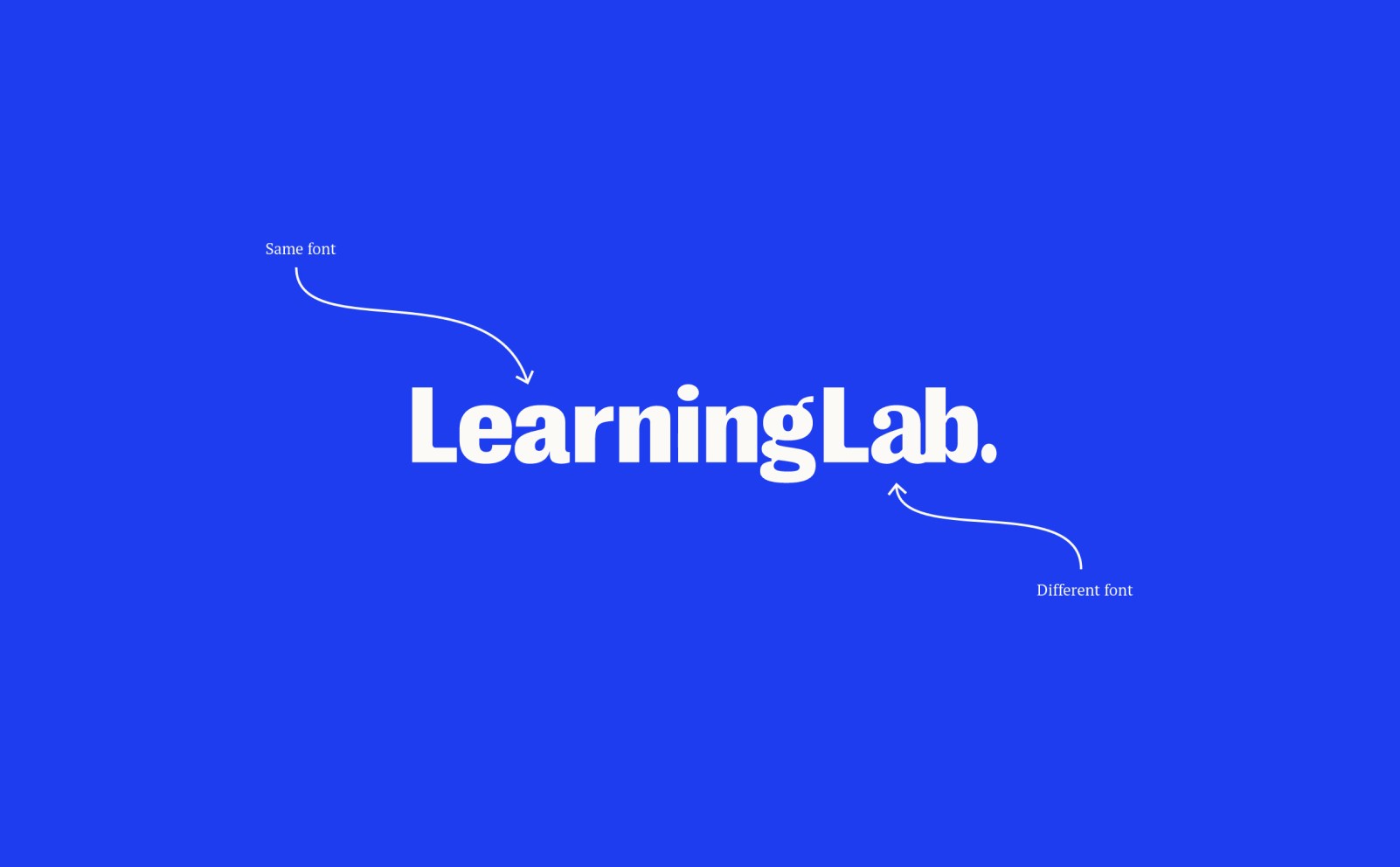
A key detail in the wordmark is the last “a” in “Lab", intentionally set in a different font. This subtle shift symbolizes one of Learning Lab’s core beliefs: you can be different and still belong. It reflects the brand’s commitment to celebrating individuality while fostering a sense of community — an inclusive space where diverse ideas and people fit together naturally.
Color Palette
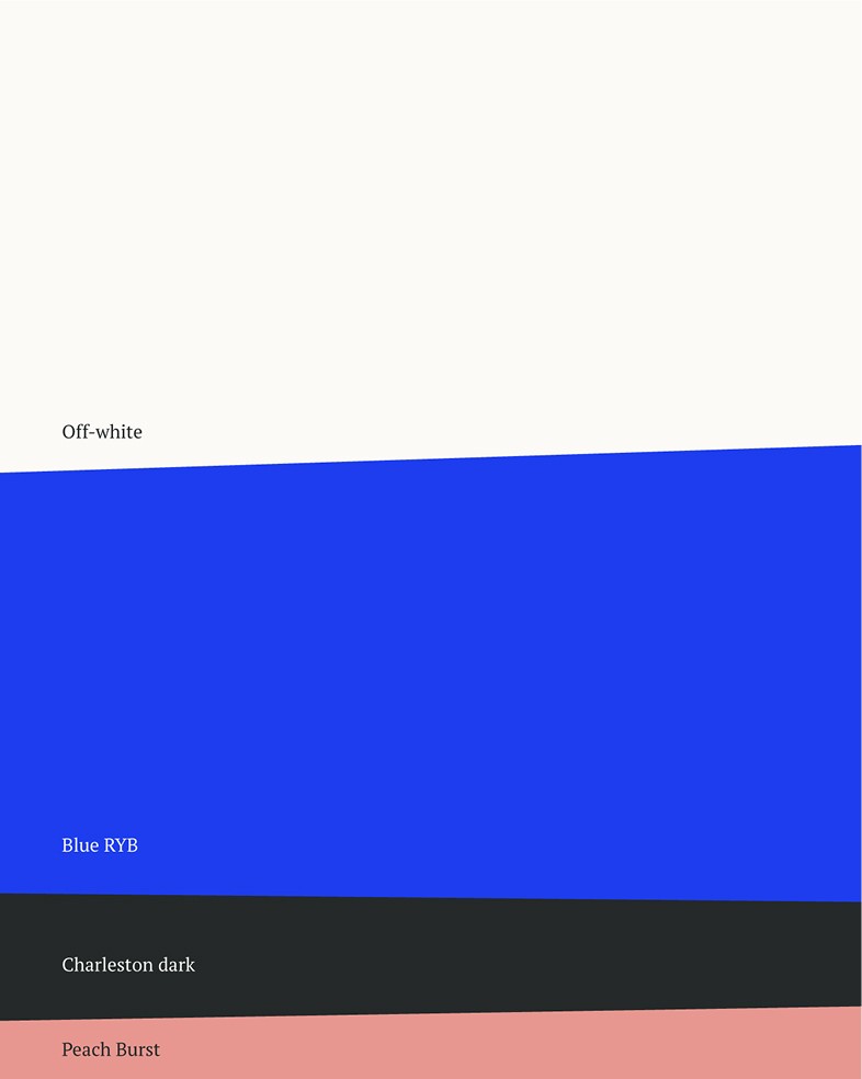
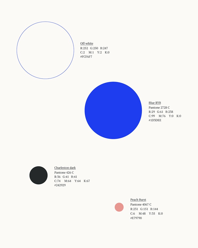
The color palette was developed together with the Learning Lab team, focusing on creating a system that feels vibrant yet balanced.
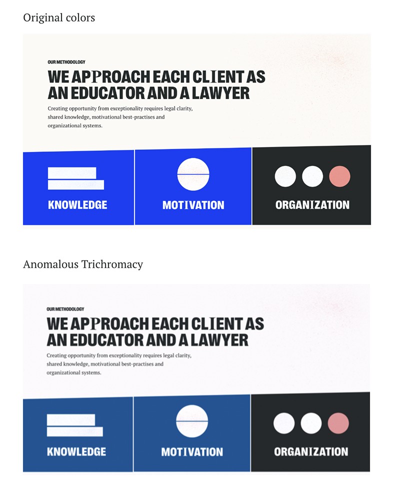
All colors were carefully tested to ensure accessibility and readability, including for users with color vision impairments. The palette supports clear contrast and works seamlessly across digital and print — making the brand inclusive and easy to engage with everyone.
Typography
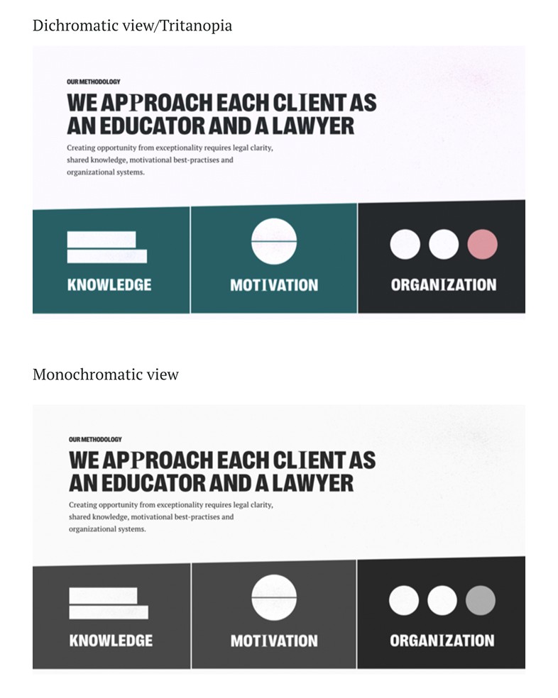
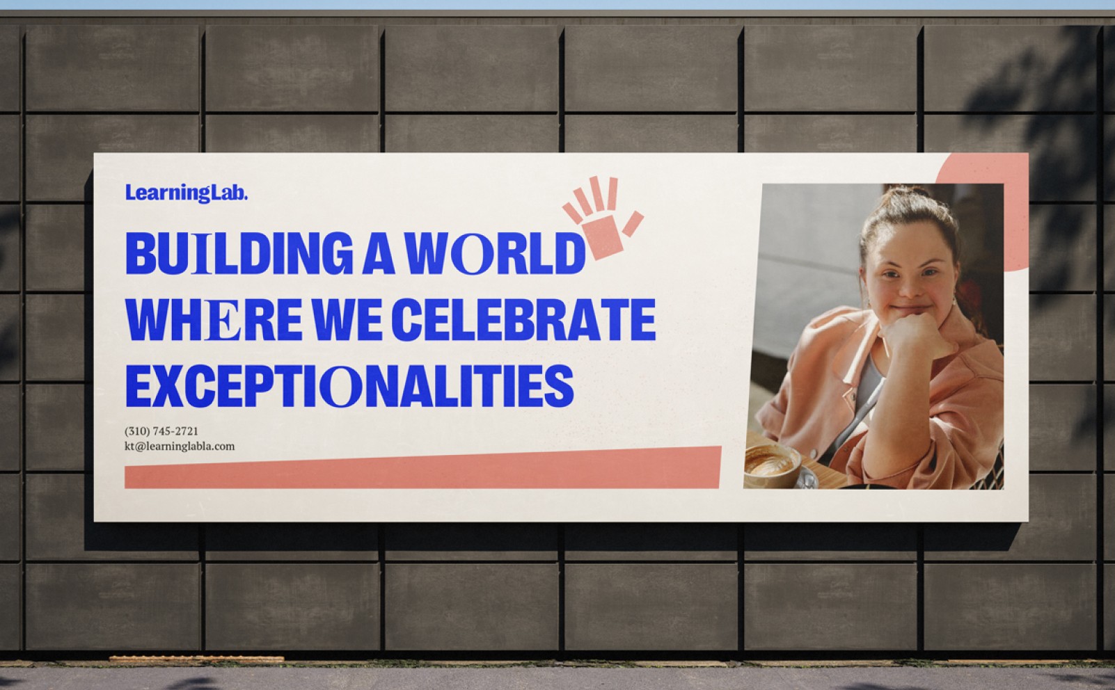
For headlines, we committed to big, bold typography to communicate confidence and clarity. We use Right Grotesk — Compact Black weight exclusively for all main headlines across Learning Lab’s applications. This strong geometric sans-serif ensures a direct and purposeful tone, perfectly aligned with the brand’s voice.
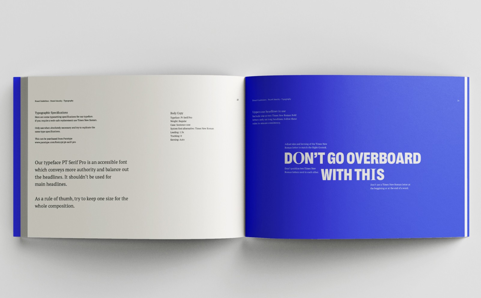
PT Serif Pro is used as a supporting typeface. Its serif design conveys a sense of credibility and trust while remaining highly readable. However, to preserve its supporting role, we avoid using it in main headlines.
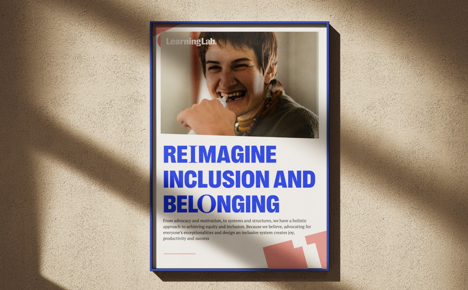
In select headers, we introduced a subtle twist: one or two letters set in Times New Roman. This detail reflects the core brand message — even if you’re different, you still belong. It adds character and reinforces Learning Lab’s inclusive, open-minded identity.
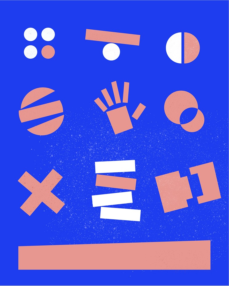
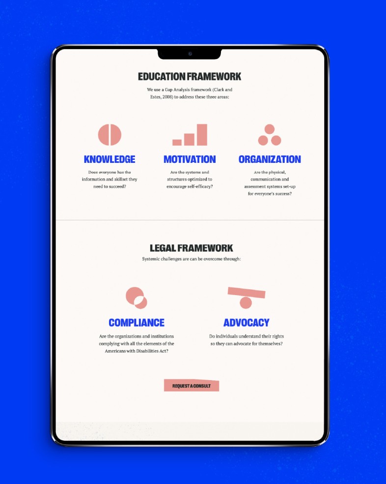
Supporting Graphics & Brand System
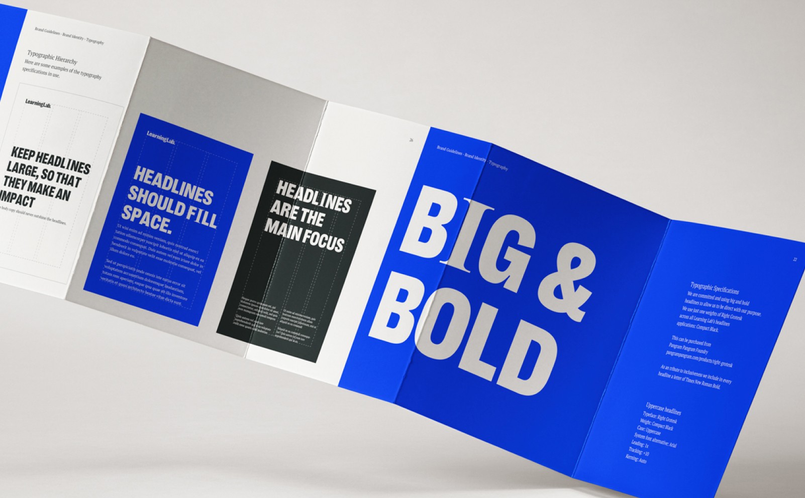
I developed a set of graphic elements — patterns, shapes, and icons — designed to expand the brand’s visual language. These assets allow the team to create dynamic layouts while keeping consistency across platforms.
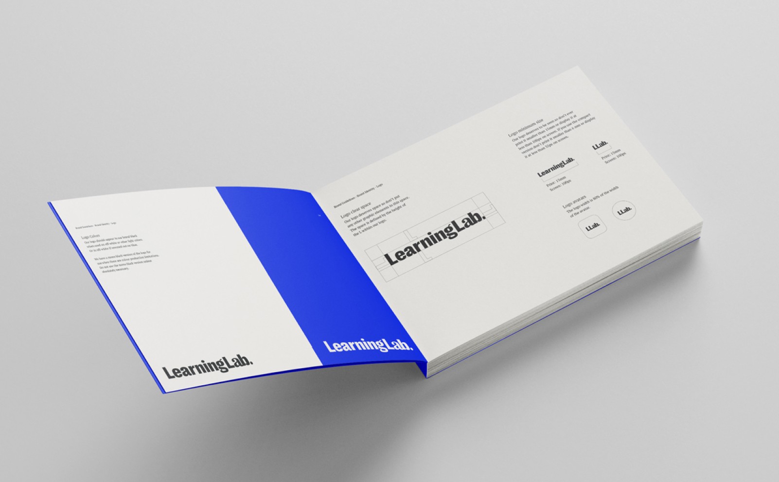
Brand Guidelines
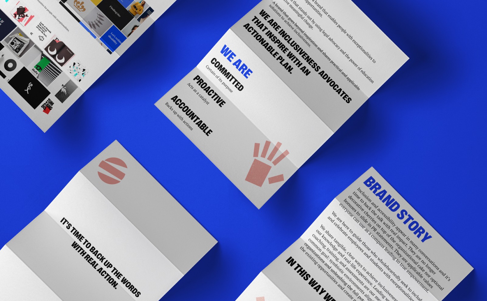
To ensure consistency and make the brand easy to use, I created a comprehensive Brand Guidelines book for Learning Lab. This guide is a practical tool designed to help their team — and any future collaborators — apply the visual identity with confidence and clarity.
The guidelines include detailed instructions on logo usage, spacing, and scaling, along with the correct and incorrect ways to apply the mark.
It covers the color palette, with accessibility considerations and examples of how colors work in different contexts.
Typography rules are clearly defined, explaining how to use Right Grotesk and PT Serif Pro, and when to introduce the Times New Roman accent letters to reinforce the brand’s core message of inclusivity.
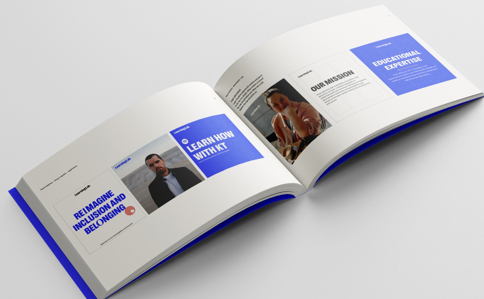
The guide also features examples of supporting graphics, patterns, and layout principles, offering flexibility while keeping the brand consistent across web, social media, print, and presentations.

Every detail was carefully crafted to help Learning Lab grow — giving them a solid foundation and a flexible system that can evolve with their needs.
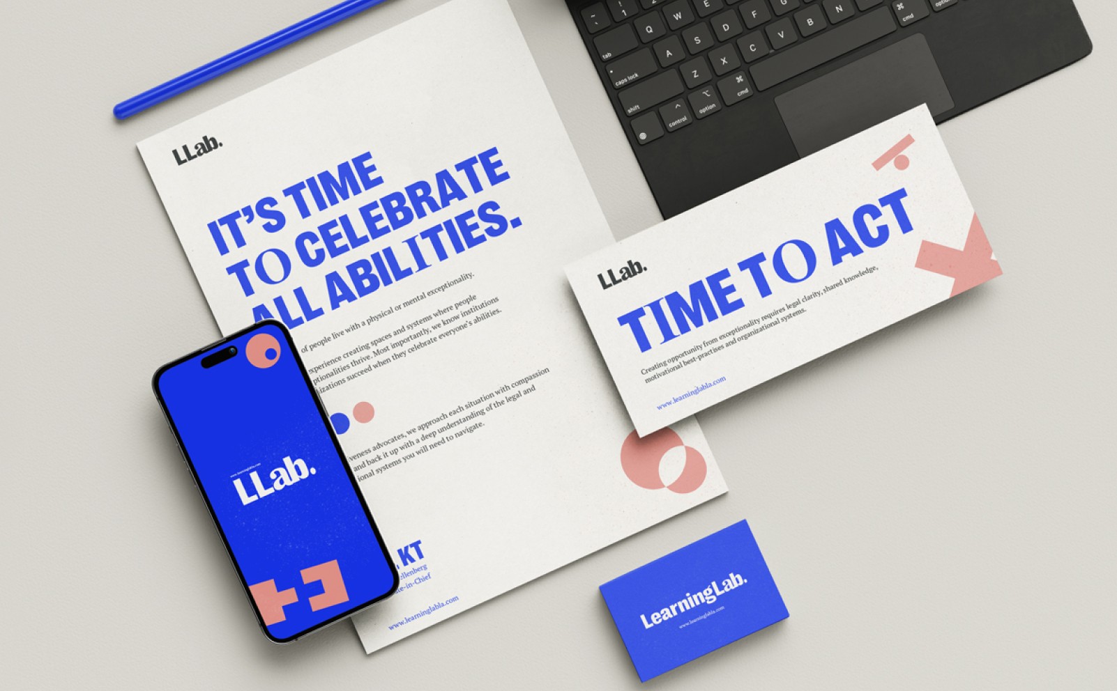
A brand comes to life when applied. The identity system was designed to adapt seamlessly across website design, social media content, presentations, and print materials — ensuring the Learning Lab team can connect authentically with their audience.
Results & Reflections
The new identity positions Learning Lab as a authentic and credible player in the education and advocacy space. It gives them the tools to scale their communication while staying true to their mission. I’m proud to see this visual system supporting their journey.

Branding & Visual Identity
Learning Lab
Learning Lab is on a mission to build a world where people with exceptionalities thrive. From advocacy and motivation, to systems and structures, Learning Lab has a holistic approach to achieving equity and inclusion.
The team approached me to craft a visual identity that reflects their innovative approach and builds trust with their audience — from students to educators and advocacy professionals.
My goal was to design a clean, modern, and flexible brand system that empowers the Learning Lab team to communicate clearly across digital and physical platforms.
Discovery and Research
The project began with a collaborative discovery session where I sat down with the Learning Lab team to deeply understand their mission, audience, and long-term vision. We explored what sets them apart, the emotions they wanted the brand to evoke, and the practical challenges they faced in communicating their message visually.
Based on this conversation, I put together a comprehensive creative brief that outlined the brand’s core values — commitment, accountability and proactivity — and set the foundation for the visual direction. This document became the reference point throughout the project, ensuring every design decision aligned with Learning Lab’s goals.
Alongside the brief, I researched visual trends in the education and creative industries, competitor branding, and other success stories. This helped define the tone — modern, playful, yet credible — and inspired a design system that feels fresh, flexible, and future-proof.
Concept Development
Early sketches and explorations focused on combining education symbols with abstract forms that suggest inclusivity and connection. Through iterations, we refined the concept into a simple yet memorable logo that balances structure and playfulness — perfectly aligned with Learning Lab’s values.
Final Logo Design
The final logo is built on a clean and balanced font that represent Learning Lab’s commitment to inclusivity and accountability. It’s simple, modern, and highly adaptable — designed to work seamlessly across digital and print applications.
A key detail in the wordmark is the last “a” in “Lab", intentionally set in a different font. This subtle shift symbolizes one of Learning Lab’s core beliefs: you can be different and still belong. It reflects the brand’s commitment to celebrating individuality while fostering a sense of community — an inclusive space where diverse ideas and people fit together naturally.
Color Palette
The color palette was developed together with the Learning Lab team, focusing on creating a system that feels vibrant yet balanced.
All colors were carefully tested to ensure accessibility and readability, including for users with color vision impairments. The palette supports clear contrast and works seamlessly across digital and print — making the brand inclusive and easy to engage with everyone.
Typography
For headlines, we committed to big, bold typography to communicate confidence and clarity. We use Right Grotesk — Compact Black weight exclusively for all main headlines across Learning Lab’s applications. This strong geometric sans-serif ensures a direct and purposeful tone, perfectly aligned with the brand’s voice.
PT Serif Pro is used as a supporting typeface. Its serif design conveys a sense of credibility and trust while remaining highly readable. However, to preserve its supporting role, we avoid using it in main headlines.
In select headers, we introduced a subtle twist: one or two letters set in Times New Roman. This detail reflects the core brand message — even if you’re different, you still belong. It adds character and reinforces Learning Lab’s inclusive, open-minded identity.
Supporting Graphics & Brand System
I developed a set of graphic elements — patterns, shapes, and icons — designed to expand the brand’s visual language. These assets allow the team to create dynamic layouts while keeping consistency across platforms.
Brand Guidelines
To ensure consistency and make the brand easy to use, I created a comprehensive Brand Guidelines book for Learning Lab. This guide is a practical tool designed to help their team — and any future collaborators — apply the visual identity with confidence and clarity.
The guidelines include detailed instructions on logo usage, spacing, and scaling, along with the correct and incorrect ways to apply the mark.
It covers the color palette, with accessibility considerations and examples of how colors work in different contexts.
Typography rules are clearly defined, explaining how to use Right Grotesk and PT Serif Pro, and when to introduce the Times New Roman accent letters to reinforce the brand’s core message of inclusivity.
The guide also features examples of supporting graphics, patterns, and layout principles, offering flexibility while keeping the brand consistent across web, social media, print, and presentations.
Every detail was carefully crafted to help Learning Lab grow — giving them a solid foundation and a flexible system that can evolve with their needs.
A brand comes to life when applied. The identity system was designed to adapt seamlessly across website design, social media content, presentations, and print materials — ensuring the Learning Lab team can connect authentically with their audience.
Results & Reflections
The new identity positions Learning Lab as a authentic and credible player in the education and advocacy space. It gives them the tools to scale their communication while staying true to their mission. I’m proud to see this visual system supporting their journey.